Dessin des crochets avec texte pour les p-value dans les graphiques
Examples
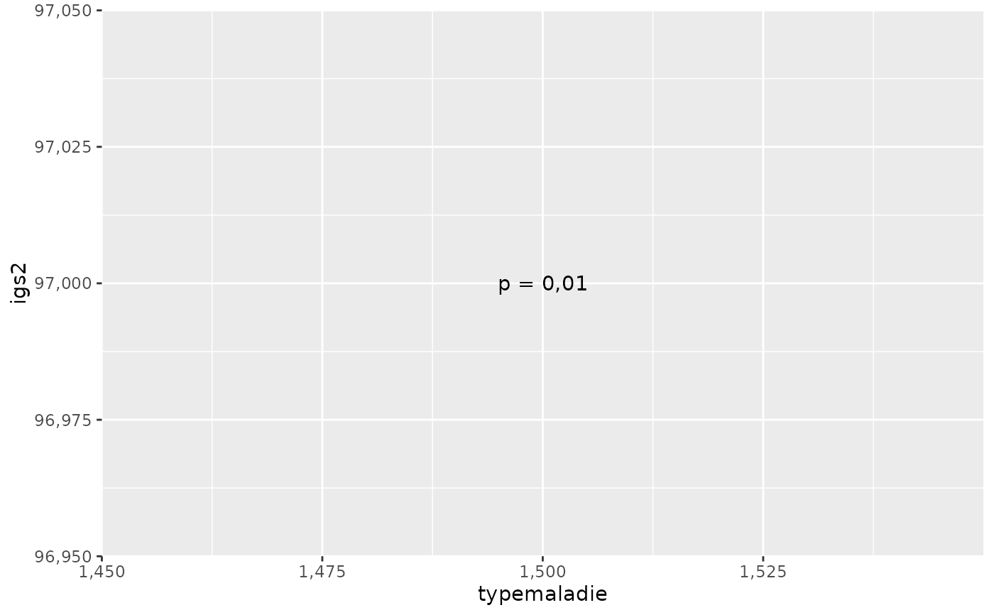
fp <- patients |>
  tidyr::drop_na(typemaladie, igs2) |>
  ggplot2::ggplot() +
  ggplot2::aes(x = typemaladie, y = igs2)
ggplot2::geom_boxplot()
#> geom_boxplot: outliers = TRUE, outlier_gp = list(colour = NULL, fill = NULL, shape = NULL, size = NULL, stroke = 0.5, alpha = NULL), whisker_gp = list(colour = NULL, linetype = NULL, linewidth = NULL), staple_gp = list(colour = NULL, linetype = NULL, linewidth = NULL), median_gp = list(colour = NULL, linetype = NULL, linewidth = NULL), box_gp = list(colour = NULL, linetype = NULL, linewidth = NULL), notch = FALSE, notchwidth = 0.5, staplewidth = 0, varwidth = FALSE, na.rm = FALSE, orientation = NA
#> stat_boxplot: na.rm = FALSE, orientation = NA
#> position_dodge2
figp(fp, x1 = 1, x2 = 2, yy = 95, pval = 0.01, od = FALSE, h = 2)